
Just about finished Rene Montoya as the Question (based on artist Cully Hamner’s version). As always, more work to be done.
Happy New Year! I hope 2013 is good for everyone.

Just about finished Rene Montoya as the Question (based on artist Cully Hamner’s version). As always, more work to be done.


Happy New Year! I hope 2013 is good for everyone.

Every year near the Winter Solstice, Hub Comics in Somerville, Massachusetts holds an exhibition of Batman art by local artists. My 12 Days of the Batman mini-busts were on display, as well as numerous other works by some great artists.
Photos of the event, taken by shop owner Tim Finn, can be seen here.
I was interviewed about the event by the Boston Herald, and you can read the article here.
Can’t wait to do it again next year, same Bat-Time…
At the conclusion of 12 Days of the Batman, John Vukelic left this comment:
“12 sculpts in 12 days is a very cool accomplishment. Did you learn anything new working on those 12 busts?”
(John’s site chronicles his process as he learns to become a fantasy and sci-fi artist, and it’s filled with great art resources as well.)
In answer to John’s question: I hate to say it, but I learned very little. But it did reinforce a lot of lessons I discovered with other sculpture sprints, such as Mighty Marvel May, as well as from years of trial-and-error. What I have learned:
Plan ahead:
Particularly when I don’t have a lot of time to execute, it’s much better to have a concrete idea before I start and not try things out as I’m sculpting. I’m terrible about sketching. I virtually never do it, to my detriment. On longer projects, I usually start sculpting and make adjustments as I go. I don’t have that luxury when trying to work this fast, but ten or twenty minutes sketching would probably have helped a lot. Also, making good armatures is always important.
If you get off to a bad start, start over:
If I didn’t make a good armature and started sculpting over it, I immediately regretted it. It actually saved me time to scrap what I’d done and do it over from scratch rather than fight with it.
Keep your materials handy:
Seems obvious, right? I tried to have all my tools, workspace (which was often my lap), and even the camera, light, and backdrop ready before I started. Except I ran out of the Sculpey Firm I use and tried gray Fimo instead (I use a mixture of Sculpey Firm, Super Sculpey, and black and white Sculpey III to make a grey, just-right material). Not the same thing, and it worked- kinda- but the last three or so days I was working with what felt like substandard material. I shouldn’t do that.
Form is more important than detail:
Silhouette, shape, proportion are all much more important to the overall look of a piece than any detail I’m going to tack on. Does it read from across the room? If not, keep working. A rookie mistake- when I can tell I’m choking- is to go to detail too soon. Make sure the form is right, then start finessing.
When working this fast, compromises have to be made:
Forcing myself to put the work up- ready or not- by the end of a day meant I wasn’t going to finish it to my satisfaction. I had to make choices about what was most important and what just had to go. Sometimes happy accidents occurred: I really liked how Poison Ivy’s hair came out in the limited time I had to detail it.
If you do a bad job, you’ll do better the next day:
Sometimes events on the day kept me from putting as much time in as I could, and resulted in some clunkers (I’ll let you decide for yourself which ones I’m talking about). I had to finish them, put them up, and move on, no time to look back.
There is never enough time, so do the best you can in the time you have:
The clock is always ticking. If you have an hour or a month you’ll never finish to your satisfaction, so just work with what you’ve got. You always have right now.
Thanks for the question, John!
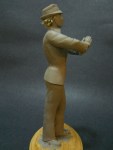
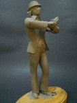
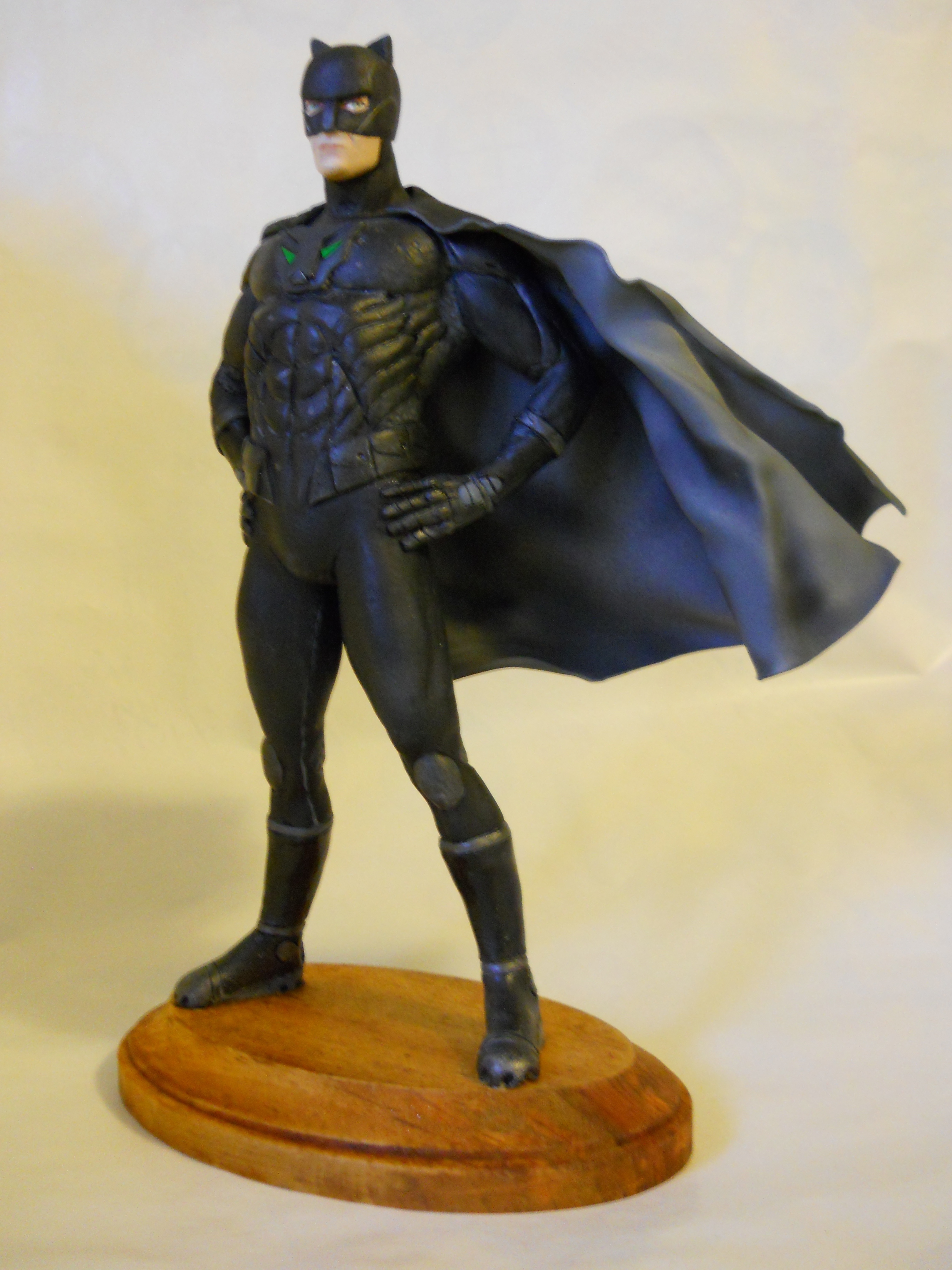
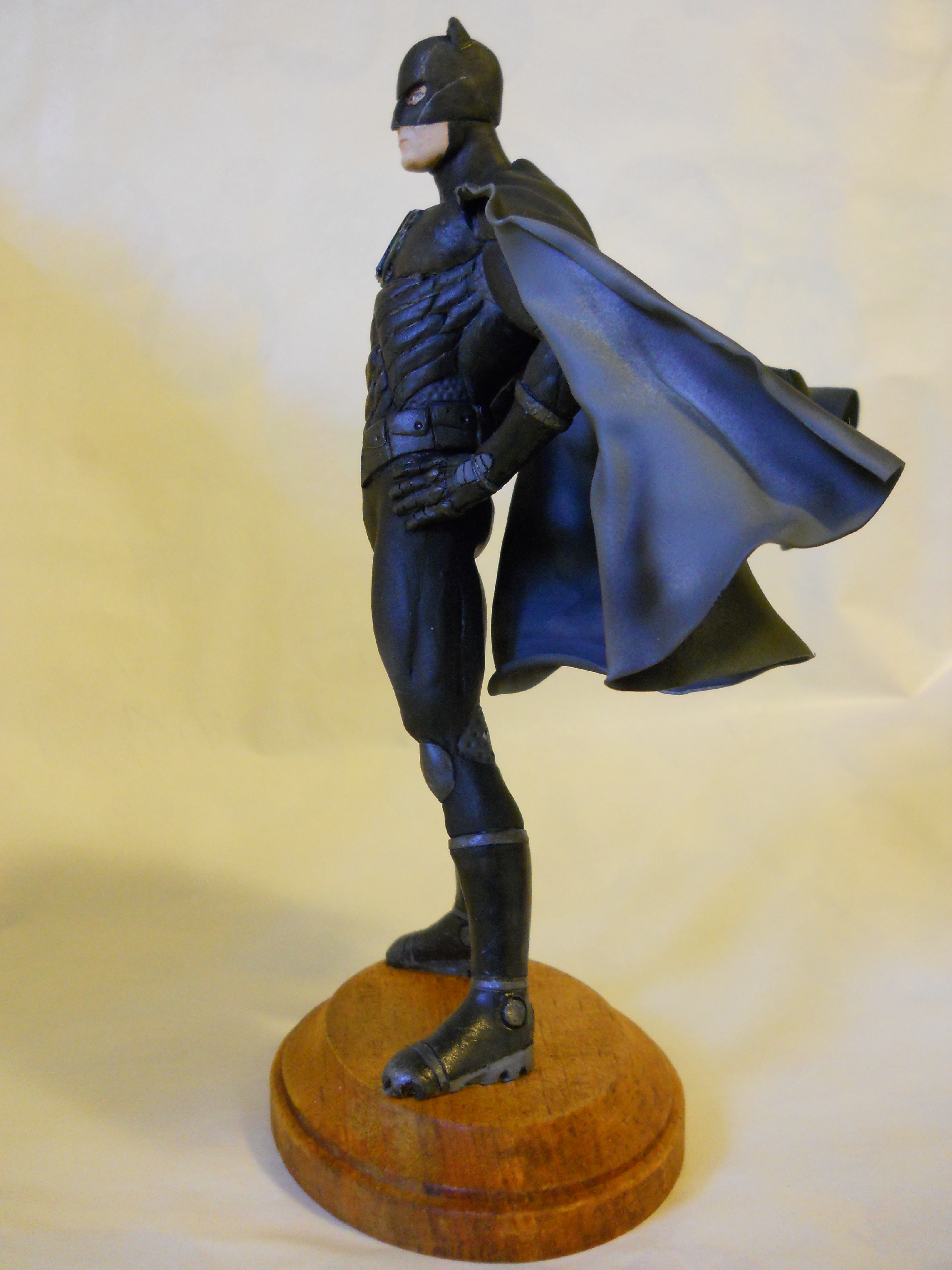
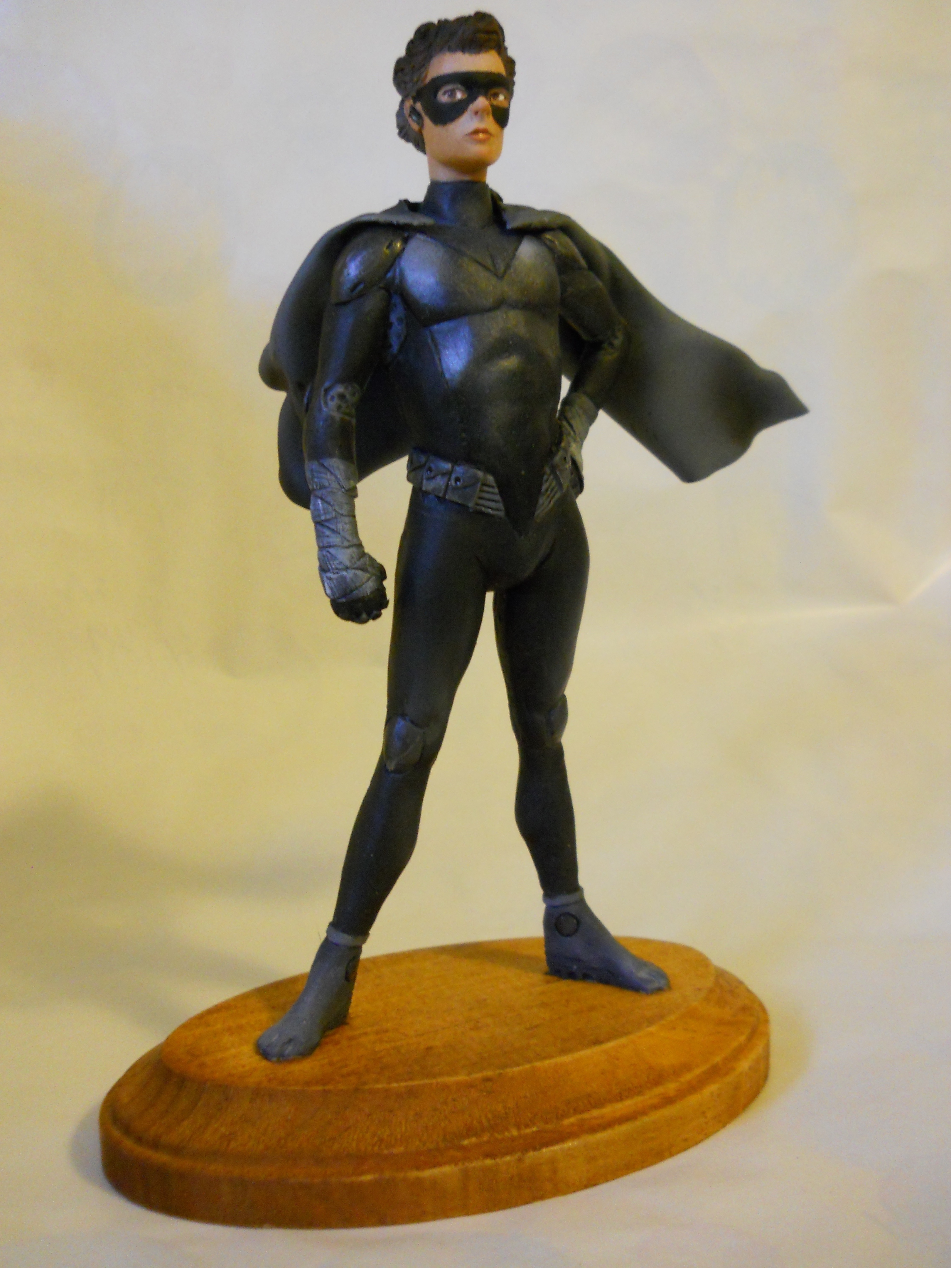
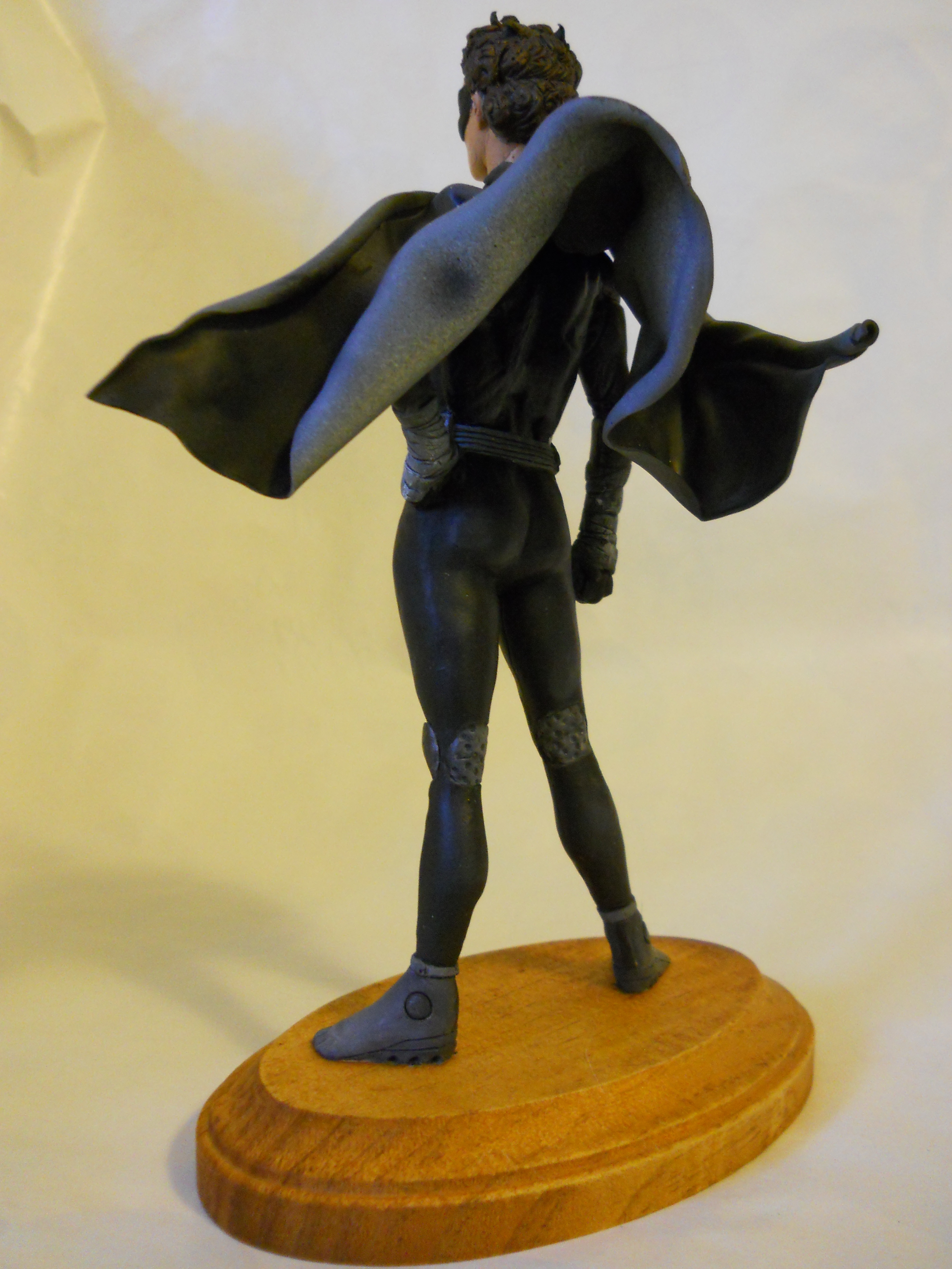
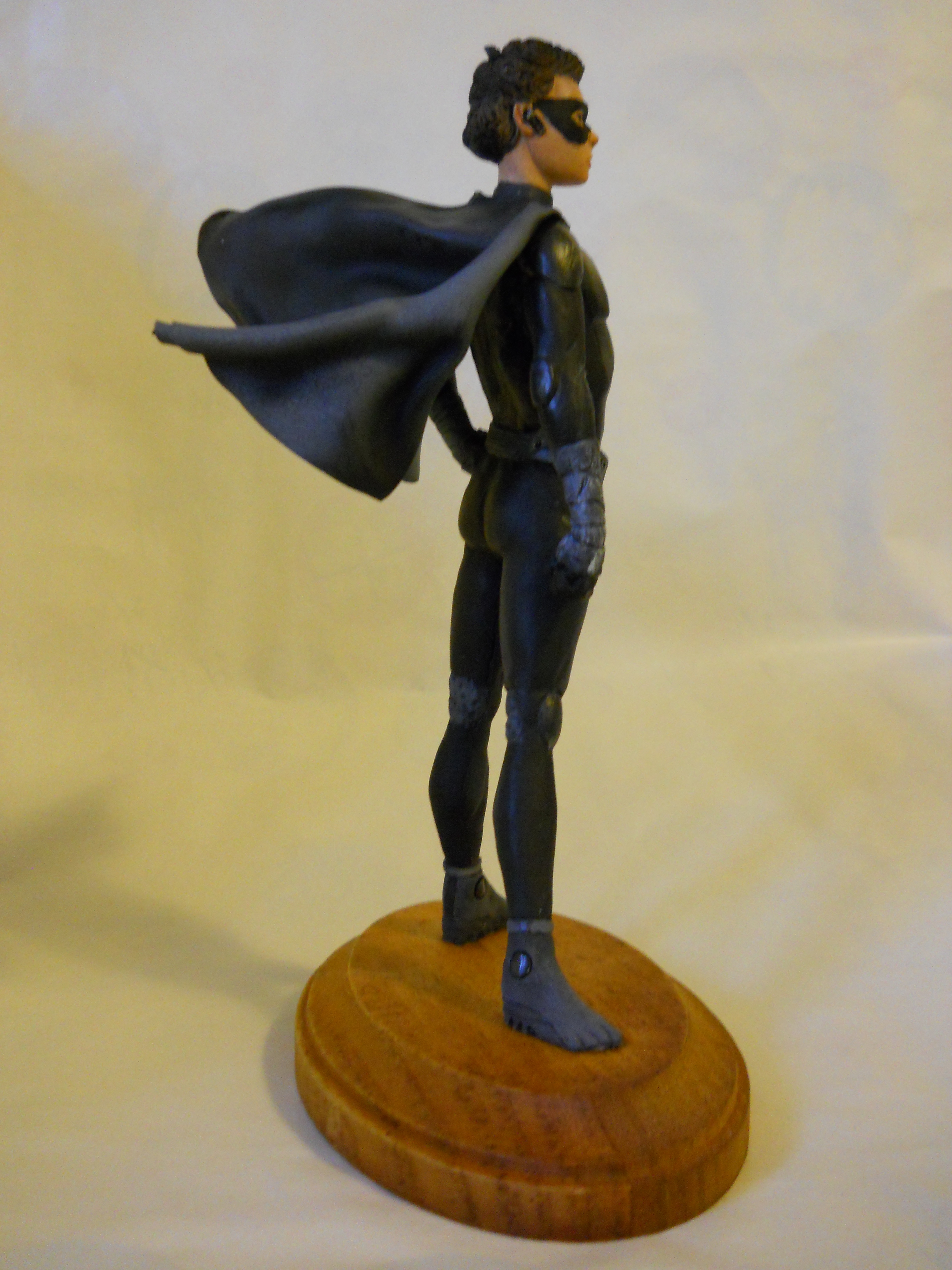
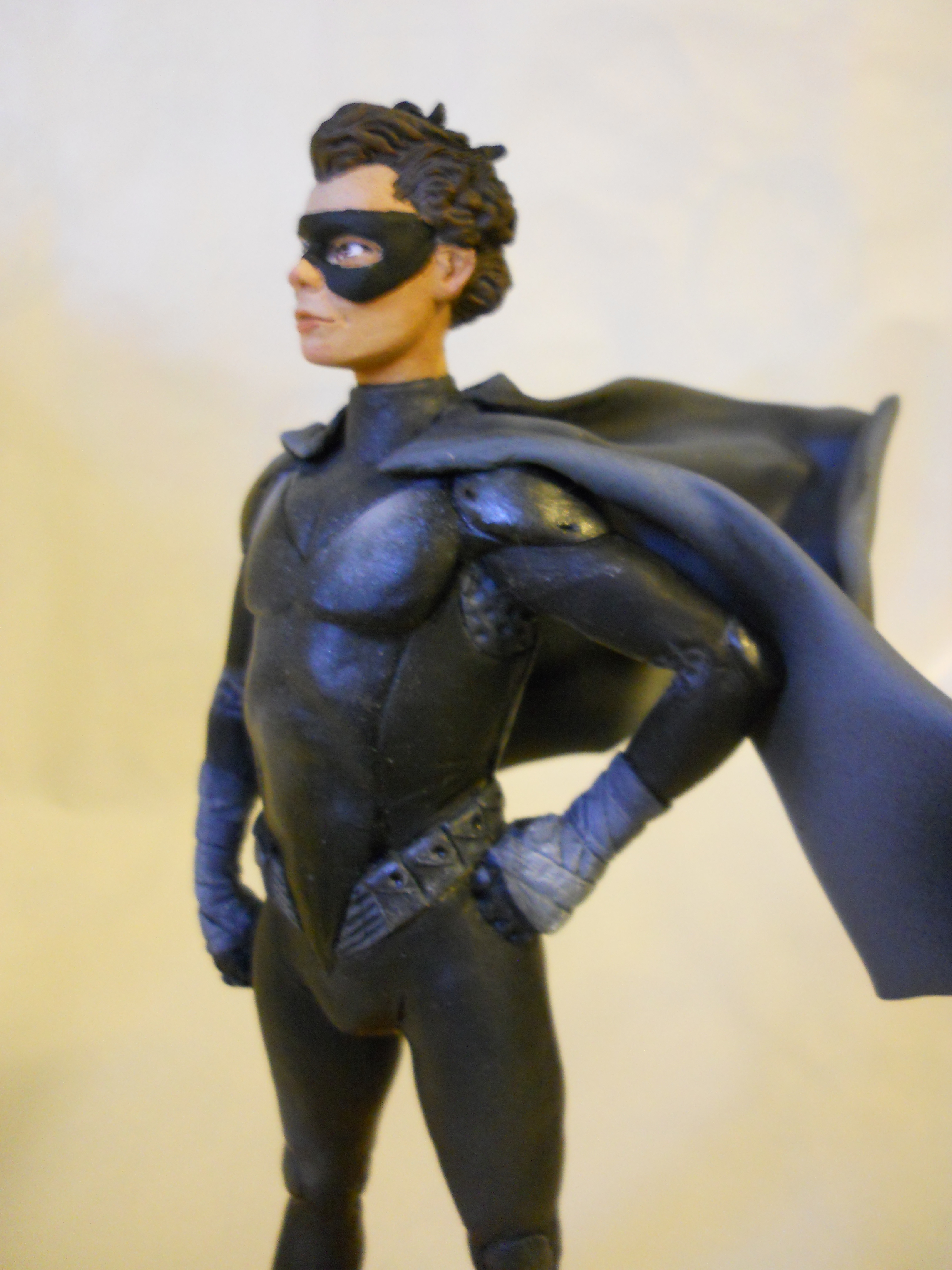
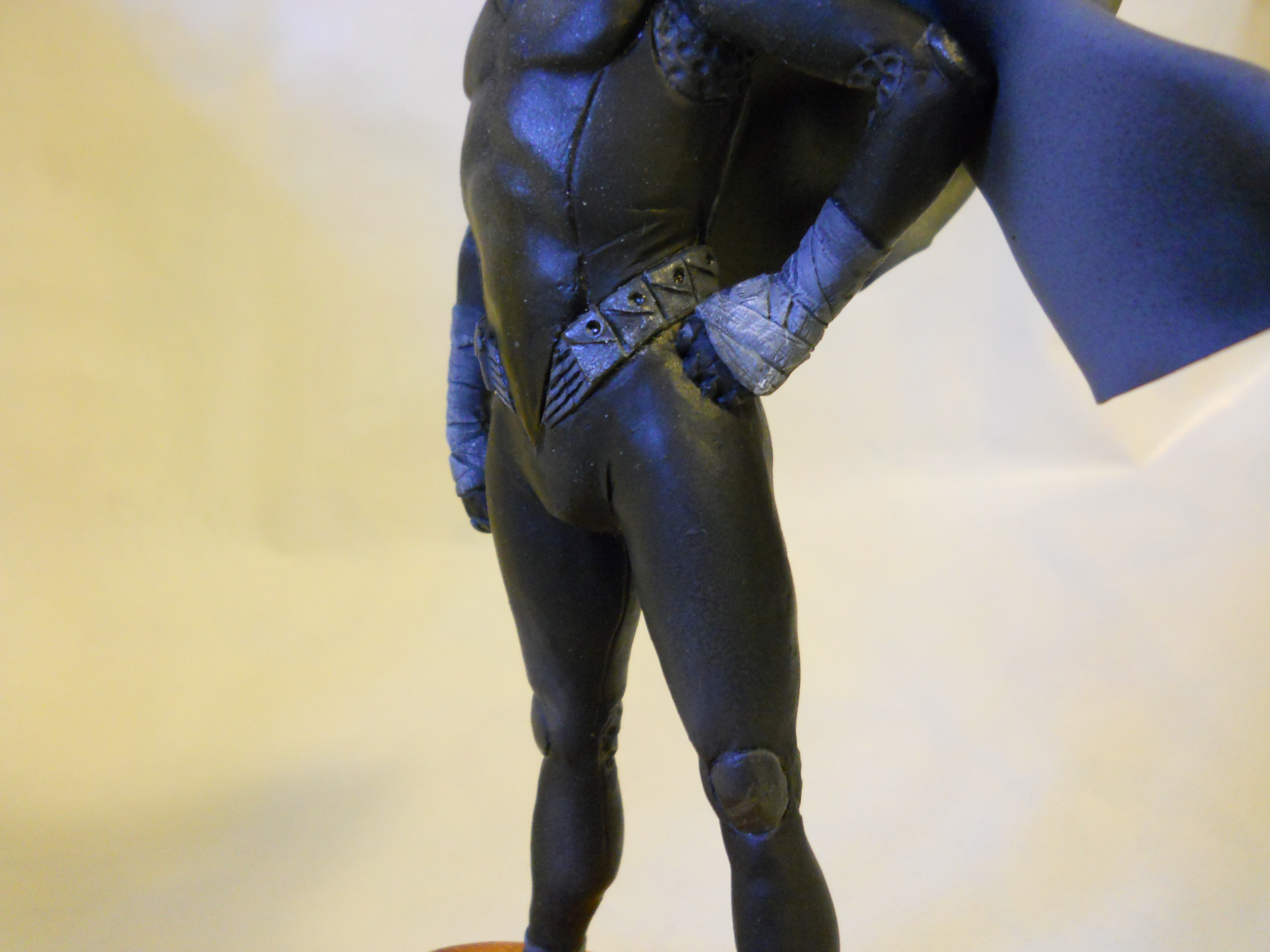
Hey, remember these guys?

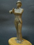
After tinkering with them for almost an entire year (!), these two crimefighters are finished. They might evoke a certain duo known for their dynamism, but are actually an entirely different solemn guardian of the night and his boy sidekick.
(Did I say boy sidekick? We sure about that? Hmm…)

These characters are from an upcoming novel. I translated the writer’s descriptions of the characters, filling in details here and there to present what I hope are modern takes on classical superhero designs. I was looking at the work of comic book artists Cully Hamner, Chris Sprouse, and Stuart Immonen, with an eye toward the costume design work of Adi Granov and Bob Ringwood.


Godzilla’s true name is GOJIRA, a contraction of the Japanese words for “gorilla” and “whale” (much like MAGNITUDE’s name is a contraction of “Magnetic” and “Attitude”).
My variation on big G was done for a Kaiju fan in an internet Secret Santa exchange. I wanted to incorporate a few more theropod dinosaur features while still keeping him recognizable (something the 90s American movie failed to do). Overall I think it worked so-so. I’d like to take another shot at him sometime.
Please don’t let the lighting fool you: this Gojira is the proper charcoal gray with no green in him.


Hurricane Sandy kept me inside all day, and since the power’s stayed on so far, I was sculpting and watching movies, including FROM RUSSIA WITH LOVE. For fun I decided to sculpt a quick mini-bust of James Bond, but as described by Ian Fleming in his novels.
“Bond reminds me rather of Hoagy Carmichael, but there is something cold and ruthless,” says Vesper Lynd in CASINO ROYALE, the first Bond novel (Carmichael had also been the physical model for The Shadow). I used Carmichael’s general description, but added the “comma”-shaped forelock of hair and scar on his right cheek (which I may have exaggerated a bit).


I should sculpt more characters from books.

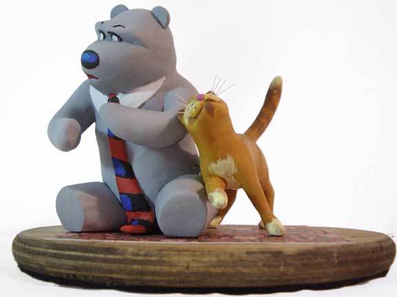
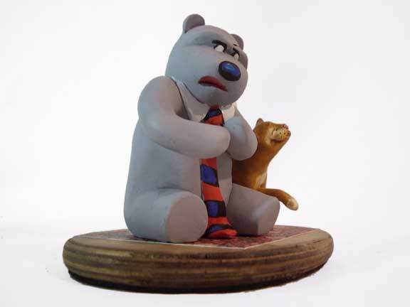
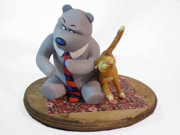
Gussy hates your housepets.
Gussy, the Big Jerk of a Little Bear, began as a recurring character in a comic book I drew. He was the insufferable ex-boyfriend of another character, forever hanging around and moping.
Eventually Gussy’s aggressive pessimism grew on me, plus he was fun to write, draw, and sculpt. He became kind of my mascot, adorning numerous website avatars, my signature, and even this site.


I’m working on an ongoing project with Sean Downey, and here is some of the what we’re working on.
Sean posed for reference photos, which I digitally painted over (those are really his clothes, though. He’s a fashion plate).

Quick and dirty, but it gets the idea across.
Sean built a couch and we put a sculpted figure on it. We built a room and put in a test window, and took test snapshots with a digital camera.

Still more work to do, but I’m encouraged by the test shots.

Just don’t look below his knees.
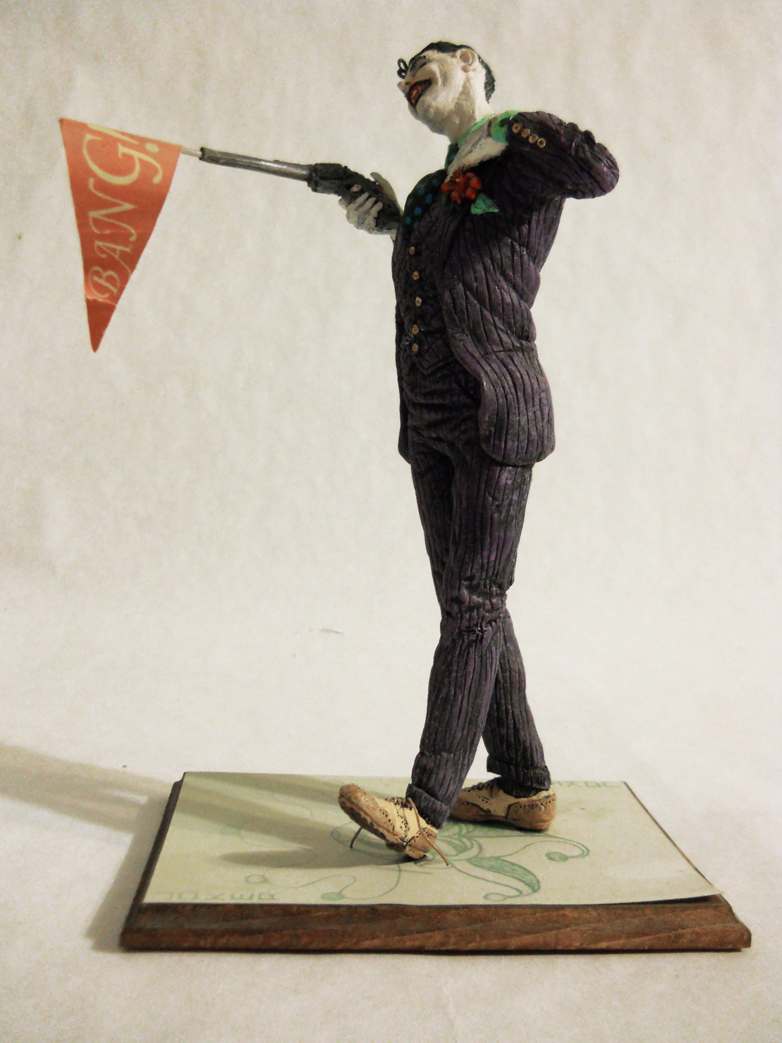
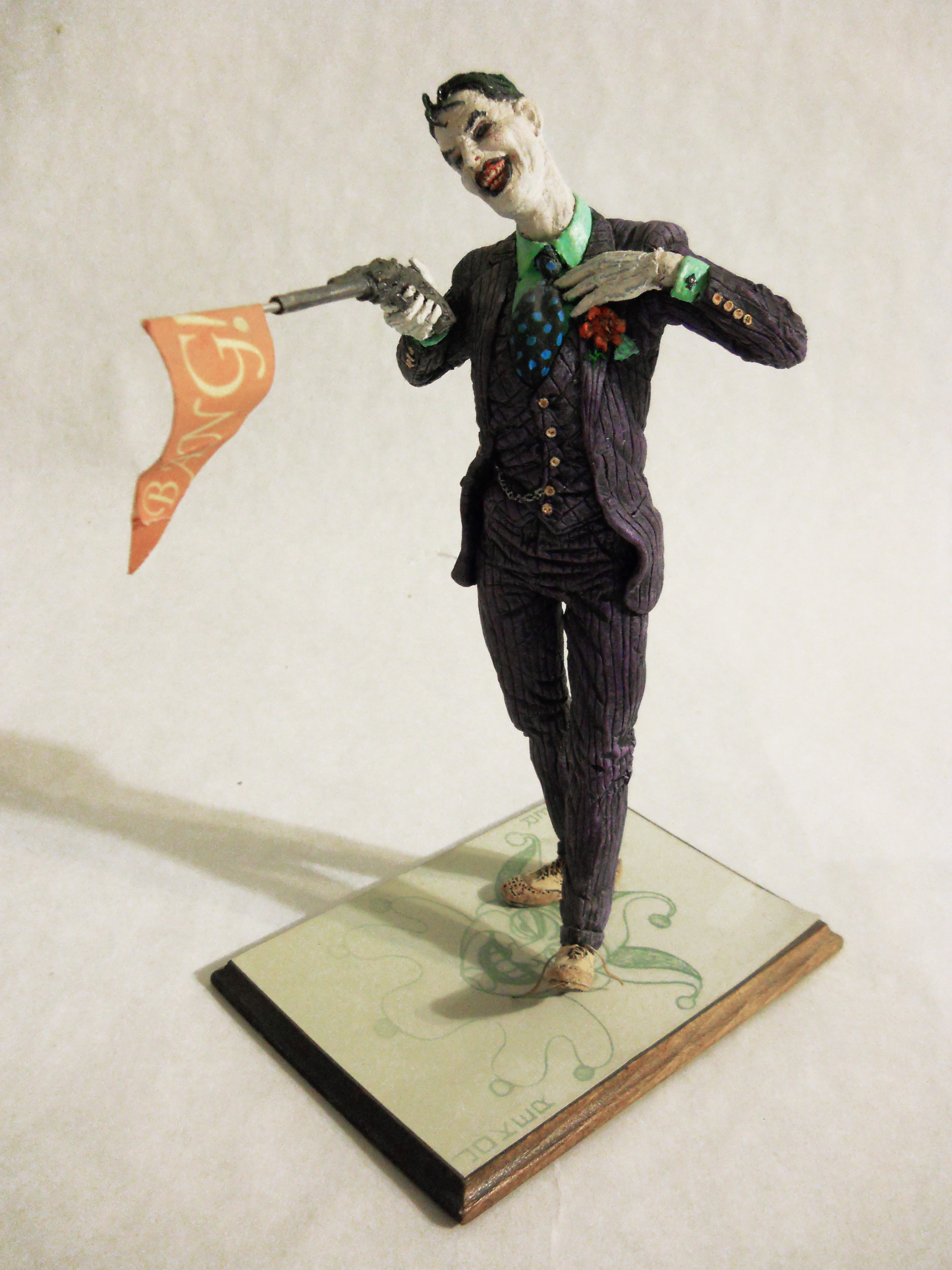
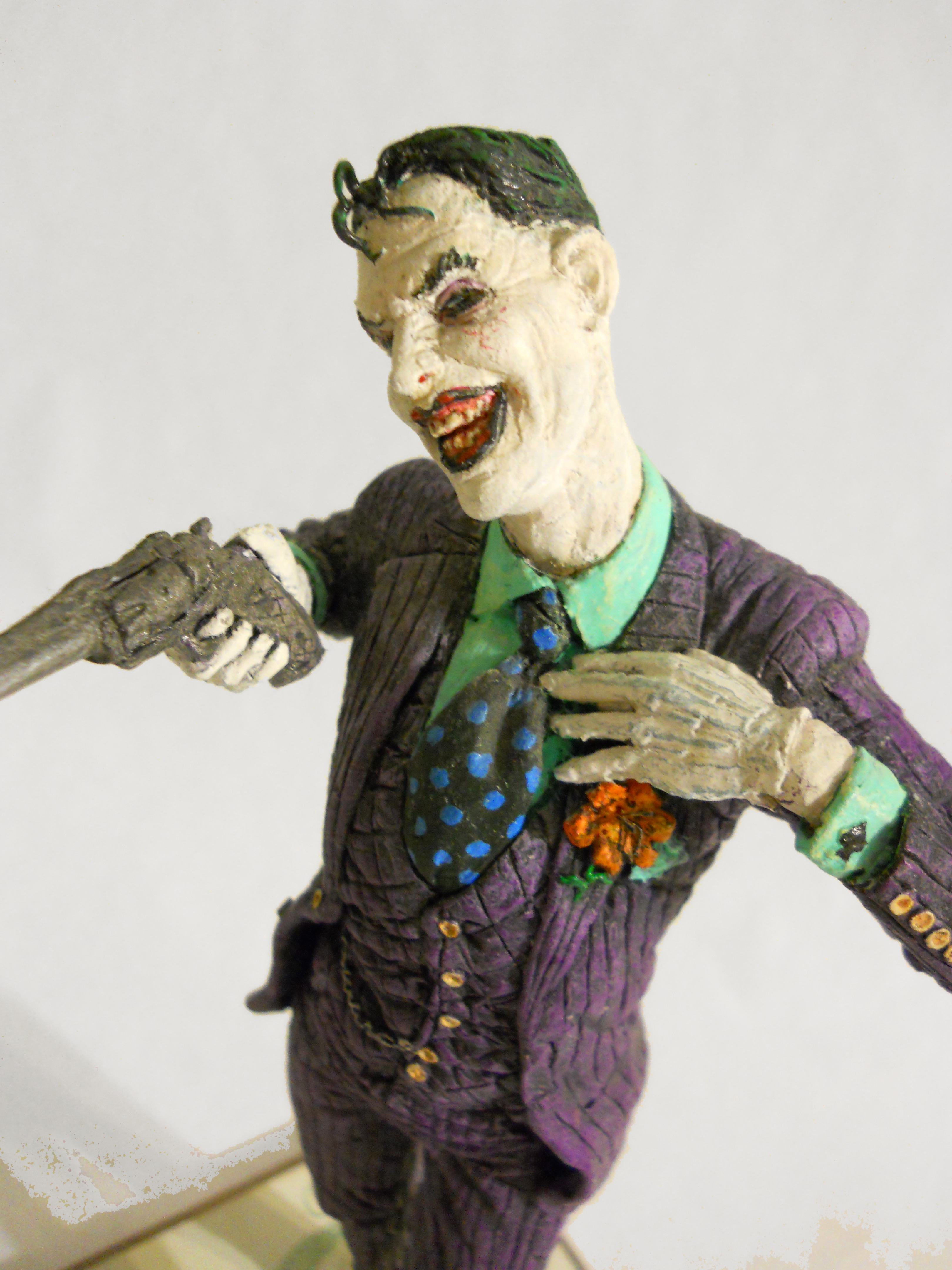
The Clown Prince of Crime.

Does the Joker need any introduction? I’m going to guess he’s the most famous comic book villain of all time.
I’ll just tell you a little about my version here.
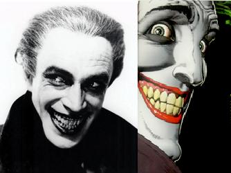
With a nod to Conrad Veidt from The Man Who Laughs, whose look inspired the Joker, I think of the Joker as a handsome man whose only deformity is his bleached skin and green hair. Otherwise, it’s his violence and unpredictability that make him a monster. I updated his traditional jacket-with-tales and bolo tie with an ensemble which, while still old-fashioned, is sharp and tailored. The Joker’s a dandy.

I also left one shoe untied. Ultimately, the joke’s on him.


The hero of my all-time favorite cartoon, SCIENCE NINJA TEAM GATCHAMAN, known (in bowdlerized form) as BATTLE OF THE PLANETS or G-FORCE in the US. Gatchaman is seen here in his unmasked civilian guise, Ken. The stand is a replica of Ken’s handy weapon, called a “Sonic Boomerang” in English (in Japan he’d shout “Bird GO!” in English when he threw it). The producers of the 2000s TEEN TITANS cartoon used this same birdlike boomerang design as Robin’s weapon.
 Ken as he appeared on the cartoon.
Comic book painter Alex Ross is a fan of the series, and did some nice covers for the DVD sets as well.

The big Gs in action.
Update 6/22/13:
They’ve made a live-action GATCHAMAN movie. I have no idea whether or not it’s going to be any good, but the trailer is suitably flashy:
